Underground Utility Construction
Magellan Utilities Construction · Florida · Magellan Group

From a consulting page to a construction brand.

We gave Magellan Utilities Construction a new identity, a brand manual and a new website, connected its B2B form straight to the company CRM, and launched a careers site run by HR.

MC
A new monogram and a full brand manual
3
Brand colors and one typeface, on purpose
CRM
B2B form straight into the company CRM
The client

A contractor built to adapt.

Magellan Utilities Construction is an agile utility construction contractor in Florida, working in directional drilling, underground infrastructure and fiber installation for utility and infrastructure partners.
Its line says it all: reliable, agile, built for what’s underground.

Visit magellanuc.com →

The challenge

The old site described an office, not a crew.

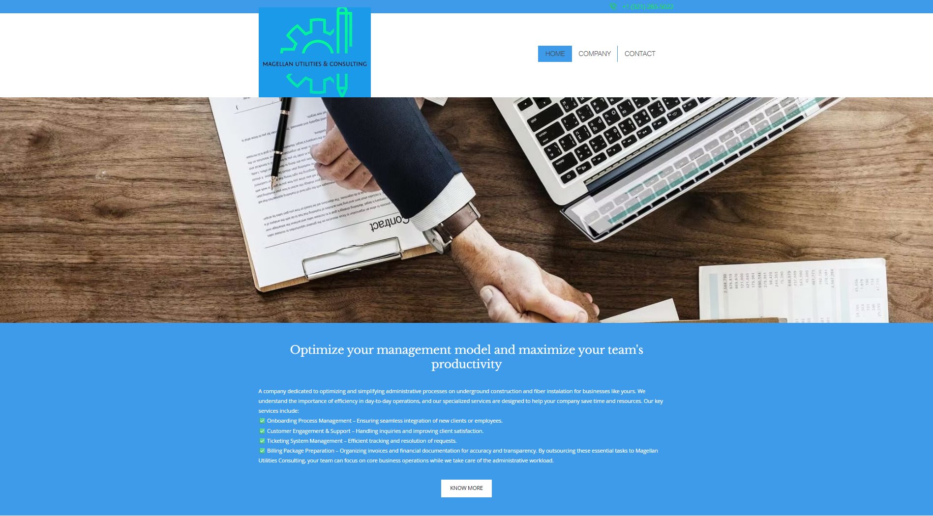
The previous brand was “Magellan Utilities & Consulting”, with a handshake photo and a pitch about administrative services: onboarding, ticketing and billing packages. It hid the company that actually puts crews underground.

  • A consulting pitch for a construction company
  • A generic logo and a stock handshake photo
  • No brand manual to keep the identity consistent
  • No route for B2B inquiries or job applications

The company had a real identity in the field and none on screen. The name, the mark and the message all needed to say construction.

The strategy

Rename the promise, then design it.

We repositioned the company as a construction contractor, created a mark that says so, and documented it in a brand manual, then built the site and the systems around it.

Pillar 01

A brand with a manual

A bold MC monogram crossed by a green line that runs through it like a conduit, with logo versions, palette, typography, clear space and rules for misuse.

Pillar 02

A site that says construction

A new website built around capabilities, verticals, why us and projects, with a hero that shows a bore path going underground.

Pillar 03

Systems behind it

A B2B form that lands in the CRM, and a careers site with an admin area run by HR.

Execution — what you see

Built to adapt. Ready to deliver.

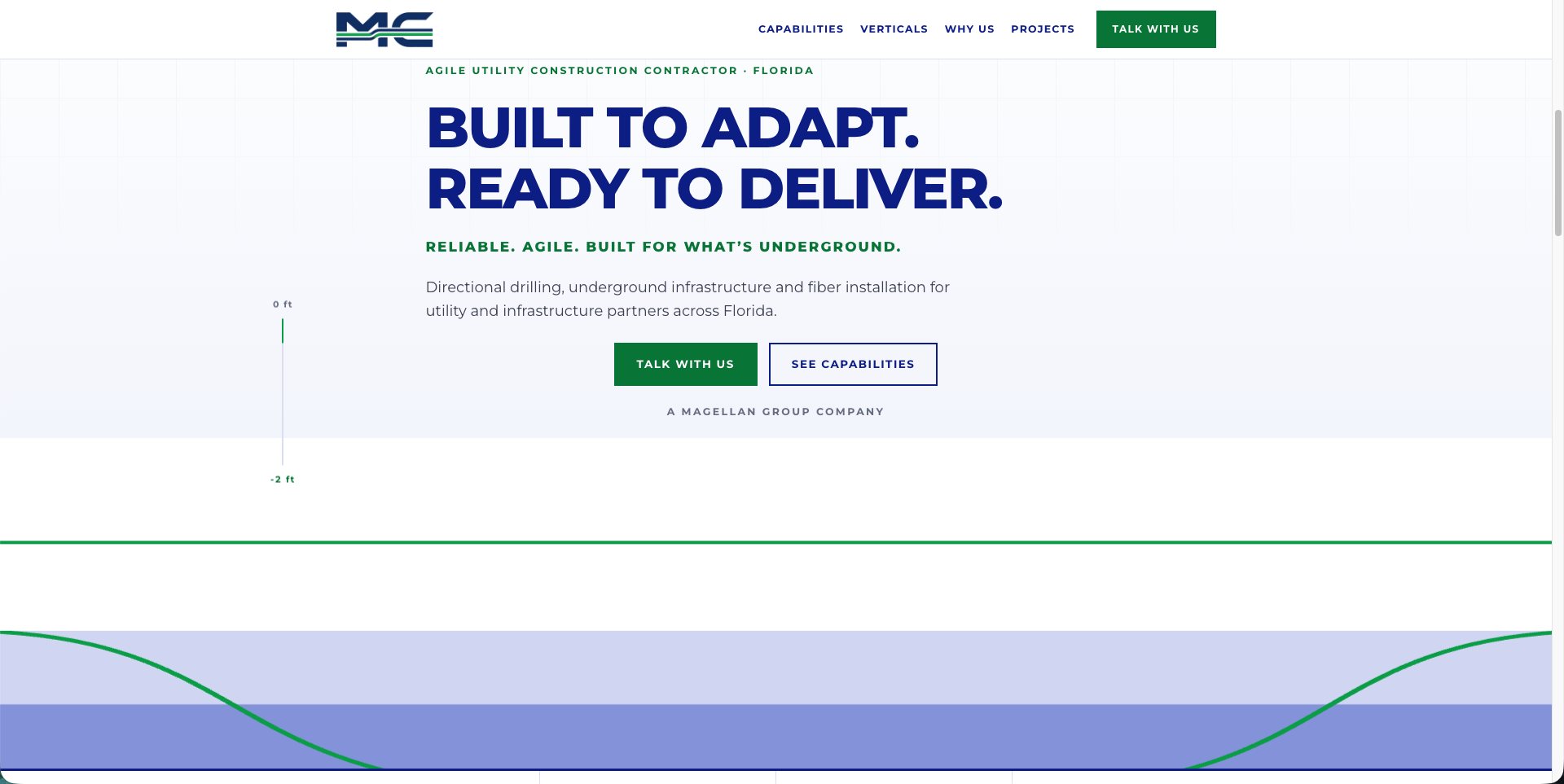
The new hero is built around the work itself: a depth gauge from 0 ft to -2 ft and a green bore line dipping underground, under a headline that promises adaptability and delivery. The header is clean and light, with a strong green action to talk with the team.

Drag the slider to compare the previous site with the new one.
Magellan Utilities Construction new site
Magellan Utilities Construction previous site
↔
BeforeAfter
Drag to reveal — old site ↔ new site
logo

Blue and green, nothing else

Magellan Blue for strength and Utility Green for the line that connects. Charcoal only for text and mono versions.

A small, fixed palette

Three colors with fixed values for screen and print.

Blue
Green
Charcoal

Montserrat, extra bold

Heavy, geometric and easy to read from a distance. Keywords: connection, safety, precision, agility, trust.

Execution — what you don't

A form that lands in the CRM, and a hiring site run by HR.

The site’s contact form sends B2B inquiries directly into the company CRM. An exclusive careers site lets candidates apply for the jobs the company publishes, and its admin area is 100% administered by the HR staff.

B2B contact formINQUIRIESCareers siteAPPLICATIONSHR admin panelRUN BY HRNew websiteTHE FRONT DOORCompanyCRM
One hub. Four connected pieces. Nothing falls through.
What it delivers

What changed.

The company now looks and works like the contractor it is.

1 brand
A new identity with its own manual
1 form
B2B inquiries straight into the CRM
100%
Of the careers admin run by HR staff
Live
magellanuc.com

Does your brand look like your work?

We can create the identity, the manual and the site that show it.

Start your project